Custom Shopify rebuild for a sustainable Frederick boutique.
Homepage rebuilt from 2 sections to 7, customer testimonials and a "How we vet" page added, proposal approved on the first read, zero added monthly Shopify-app cost.
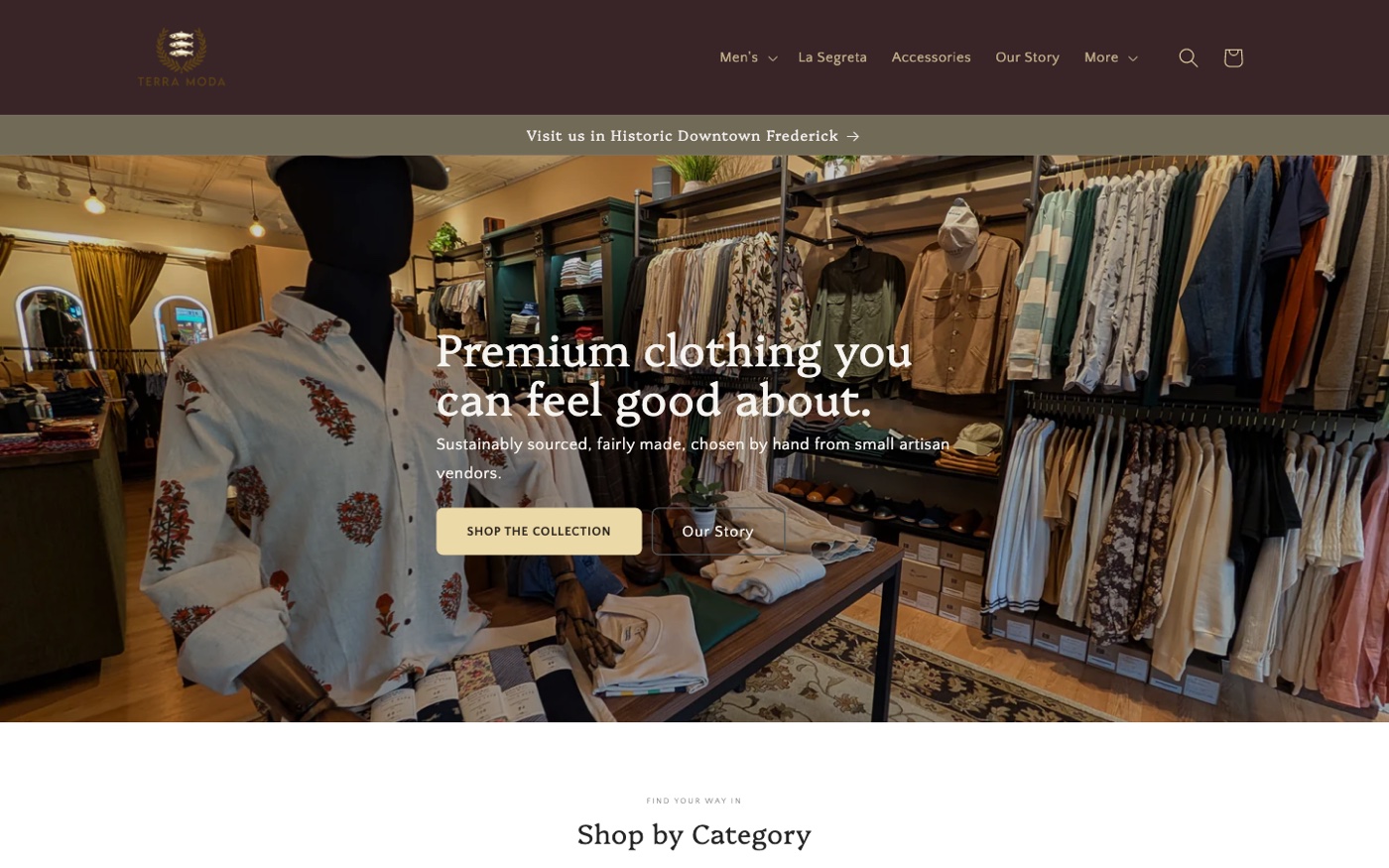
Took a family-owned Frederick, Maryland boutique’s Shopify store from a homepage with two sections (a single cover photo and a 400-word text block) to a research-backed redesign the owner approved in one review, then built it on their live Craft theme. Every recommendation in the proposal is cited. Every section in the rebuild has a reason. No paid Shopify apps added.
The problem
Terra Moda is a small, family-run boutique in downtown Frederick. They carry men’s, women’s, children’s, and dog products from artisan vendors with real sustainability and fair-labor credentials (Fair Trade, B-Corp, GOTS). The product is great. The brand story is real. The store at 218 N Market St is a destination.
The website was not pulling its weight.
When the owner came to us, the storefront ran on stock Shopify Craft, lightly configured. A look at every theme file and the live site surfaced four problems, and each one had a measurable cost:
- The home page showed no products. Two sections total: a wide cover photo of the store interior, and a 400-word “Who We Are” paragraph. A first-time visitor could not see a single thing for sale without clicking into the nav.
- No social proof anywhere. No reviews, ratings, or testimonials, despite the brand having Fair Trade, B-Corp, and GOTS certifications worth showcasing.
- The brand story was buried. The “Who We Are” copy is genuinely good. It sat below the fold, in a dense paragraph, where almost no one reads it. The strongest differentiator was the least-seen asset.
- Polish gaps that read as “unfinished.” Empty footer brand fields, zero spacing between sections, reveal animations turned off, and a dead 175 KB
sparkle.gifloading on every single page.
This was not a broken codebase. The Craft theme was clean. The problem was configuration, merchandising, and content strategy. So the engagement started with a written, evidence-grade case for change, not with code.
What we built
A proposal you can read in a browser, send to a partner, and approve in one sitting
Most agencies open with a slide deck and a mood board. We opened with a written, self-contained proposal the owner could read end to end on their own time — no kickoff meeting required, no waiting for the next session to see the recommendation.
The proposal does six things, in order:
- An honest audit of the existing site. Every finding paired with a one-line cost statement so it reads as a business problem, not a design opinion.
- The evidence. Six stat cards, each backed by independent UX and ecommerce research — the kind of citations a co-founder or investor can vet, not vibes-based design talk.
- Competitive context. A reading of nine independent and sustainable fashion stores that balance storytelling, conversion, and a physical retail location. The pattern the strongest ones share: the brand story sits between shopping paths, never as a wall in front of them.
- Three proposed directions, fully mocked in the document itself using only the client’s existing vendor photography. No requirement to provide new assets just to evaluate the work.
- A clear recommendation, with the trade-offs of the other two written down rather than buried.
- A three-phase rollout so the highest-impact, lowest-risk work lands first.
The three directions optimized for different goals — brand-led (premium feel), conversion-led (catalog-forward, testimonials early), or balanced (story sandwiched between shopping paths, the Frederick store elevated to a first-class section). The owner approved the balanced direction on the first read. No second round. No deck. No “we’ll think about it for a few weeks.”
An editorial storefront with the local store at the heart of it
We rebuilt the homepage on the existing theme, not a new one. Theme replacements break product metafields, redirects, integrations, and years of customer-side detail that nobody notices until it’s gone — and the existing theme was clean. The problem was never the code. It was that the home page was doing none of the work a home page should.
The new homepage tells the whole brand in one scroll:
- A first impression that shows the brand. An editorial hero with two clear paths — shop the collection or read the story — instead of a wall of text.
- Products visible above the fold. A four-tile category grid, then a featured-product strip, so a first-time visitor can see what’s for sale without clicking the nav.
- The story told the way people read it. A scannable three-value strip — Fair Labor, Sustainable, Artisanal — with a single door into the full “Our Story” page, instead of a 400-word paragraph nobody finishes.
- Real social proof, for the first time. A testimonials block with three named, location-tagged customer quotes — the storefront had carried zero social proof before, despite the brand earning plenty of it.
- The women’s collection treated as a brand within the brand. La Segreta gets its own editorial band with a dedicated shop CTA — the way the collection actually sits in the physical store.
- The Frederick store as a first-class destination. A Visit-Us section with an embedded map, hours, and a “Get Directions” CTA. The retail location used to be a footer line. Now it’s a section.
That took the home page from two sections to seven, each one earning its place.
Alongside the homepage, we filled the gaps that made the old site read as unfinished: spacing between sections, reveal-on-scroll animations, a dead 175 KB asset deleted from every page load, brand fields filled in, a utility bar with trust signals and the local hook. Plus a self-sufficient mega-menu the owner can edit without needing a developer, a redesigned product detail page that puts the product first instead of upsell widgets, a branded contact page that replaced an off-the-shelf form block, and a localized “One Size” badge on product cards that recognizes single-size pieces automatically.
A “How we vet” page that makes the certifications legible
The brand’s strongest differentiator — every vendor vetted against real third-party standards — was completely invisible on the old site. We built a dedicated “How we vet” page that frames Terra Moda as a curator, not a certifier: a reference grid explaining what Fair Trade, B-Corp, and GOTS each actually verify, a stat band quantifying the catalog (100% of the baby line organic, 98% natural fibers, nine credentialed vendors), and a vendor spotlight showing radical supply-chain transparency as a concrete example. It’s linked from the footer, and it replaced a thin, easy-to-miss “Trust” line that was doing the message no justice.
What we deliberately did not do: no paid Shopify apps added (the homepage testimonials are curated social proof shipped now in stock Craft; the verified per-product review system is being built as custom code in Phase 2 so the client doesn’t carry a permanent monthly fee), no theme replacement, no images forced (the hero and La Segreta image slots fall back to the theme’s native placeholder so the owner can pick the editorial imagery later without blocking the rebuild).
Product copy rewritten across the entire catalog
Every product page is getting a full rewrite, not just the names. Every paragraph. The previous copy read like default Shopify variant fields — color, size, material, repeat — for products whose whole point is the maker behind them. The new copy talks like the brand actually talks. Each piece is tied to its vendor and the materials’ provenance, references the certifications behind it (Fair Trade, B-Corp, GOTS where applicable), and matches the editorial voice of the Direction 3 rebuild. Product pages stopped feeling like a catalog of items the store happens to carry and started feeling like the brand’s argument for why this specific piece, from this specific maker, sits on the rack at 218 N Market St. On a brand whose entire pitch is the story behind the product, leaving the default Shopify copy in place was leaving the strongest asset on the table.
The three-phase rollout
The work is sequenced so the highest-impact, lowest-risk changes land first:
- Phase 1 · Home page rebuild + quick wins. The Direction 3 homepage, spacing/animations/asset-cleanup fixes, footer brand fields, the utility bar. (Shipped to the development theme.)
- Phase 2 · Trust and merchandising. Visit-Us section with map and events hook, customer testimonials, the “How we vet” transparency page, the localized “One Size” badge, gratitude-framed email capture, certification credibility, collection-page polish, product copy rewritten across the entire catalog, template cleanup, and verified reviews and ratings built in code. (Largely in progress.)
- Phase 3 · Conversion polish. Product-page improvements (large imagery, scannable variants, sticky add-to-cart on mobile), cross-sell, a mobile pass top to bottom, and local SEO + Google Business Profile alignment — because most in-store purchases start with an online search the night before, and the storefront has to show up in that search to capture them.
Outcome
- A proposal that landed on the first review. No round-two design churn, no “we’ll think about it for a few weeks.” Recommendation approved, rollout sequenced, build started.
- Homepage went from 2 sections to 7. From a single cover photo and a wall of text to an editorial hero, a category grid, a featured-product strip, a brand-story value strip, customer testimonials, a dedicated band for the women’s collection, and a first-class section for the Frederick storefront. Every new section earns its place.
- The certifications became a destination. The vetting story moved from an invisible brand claim to a standalone “How we vet” page, linked from the footer, with each standard explained and quantified.
- Zero added monthly cost. Every pattern the proposal recommends, including the one normally bought as an app (verified reviews), is being built as custom code in the theme.
- A clear, defensible story to send to a partner. The owner can hand the proposal HTML to anyone — a co-founder, an investor, a friend with retail experience — and they can read why each change is happening without a meeting.
- The brand story moved from a buried below-the-fold paragraph to a scannable three-value strip with a dedicated door into the full story. Most visitors scan instead of read — the rebuild meets them where they are, while still giving the readers a clear path to the full version.